Hertz a ridesharing app: UX Research & Testing
As a team of four design students at General Assembly, we examined and transformed Hertz' existing business model into the RideSharing space.
Duration: Two Weeks
Designers: A team of four designers
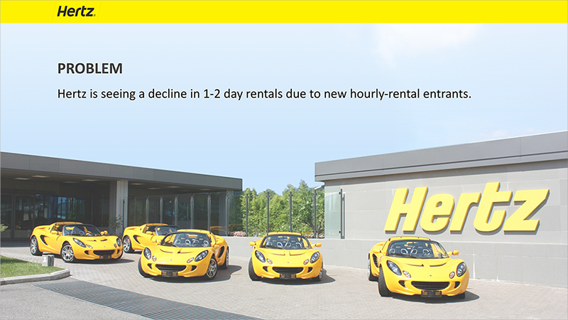
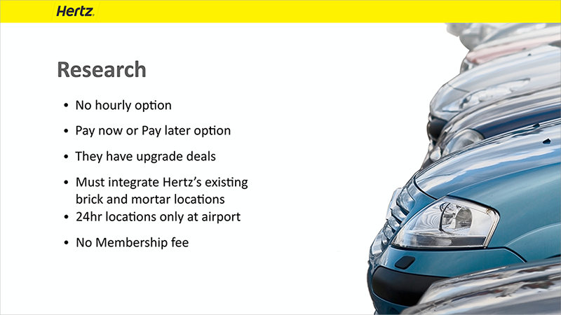
The Hertz Business Problem:
Hertz was seeing a decline in 1–2 day rentals due to new hourly-rental entrants.
Goal
Come up with a unique solution to solve Hertz’s loss of 1–2 day rentals, that could incorporate a social rideSharing aspect, and still integrate with Hertz’s existing brick and mortar locations and not over haul the existing structure.

Video Prototype
Case Study

TEAM & INITIAL CHALLENGES
Initiating a conversation to clarify and establish roles.
Past experience has taught me that clarified roles will be one of the keys to a successful project. To determine what roles we each may have wanted to take on, I suggested a conversation around goals, our strengths and challenges.
It was decided early on that others on my team were keen to wireframe and prototype. I'm comfortable wireframing but have less experience with research, so I offered to lead research and provide art direction.

The beginning was a messy process, so we just jotted ideas to see how we could narrow down our broad user base.

Survey & User Interviews
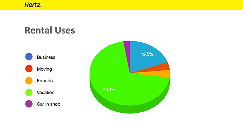
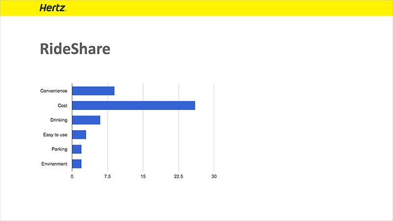
We crafted a survey via Google Surveys and sent it out to the folks in our circles. After a few days and over 70 responses we we gained some useful insights.
Cost & Convenience.
People use RideSharing because it’s a cheaper option and the pick up/drop off model.

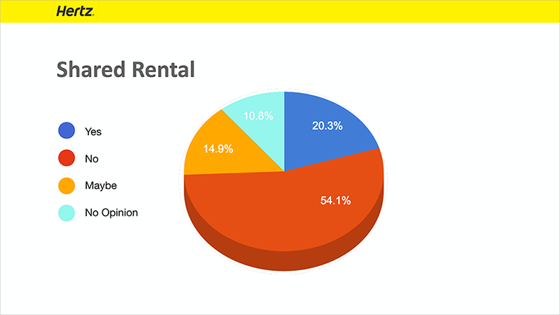
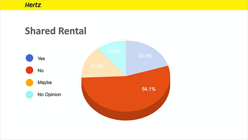
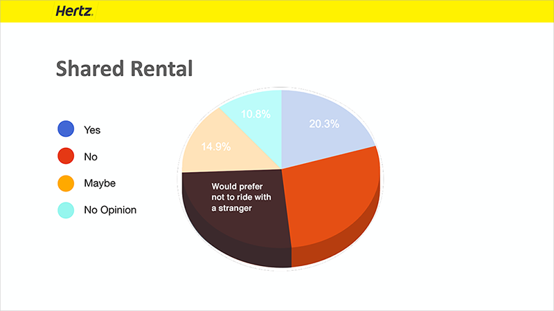
Stranger Danger.
We asked specific questions around RideSharing and sharing a car with someone else. We learned people don’t like the idea of riding or driving with a complete stranger.

User Interviews and Insights
Upon further questioning, we learned if folks have a way to vet possible drivers and riders then these “strangers” are not quite the people they thought they were.
“I would share a car with someone I didn't know if we had the same taste in music"
"I would share a care with a stranger if I somehow knew they had been verified as a safe driver or were a friend of a friend."
We each conducted interviews to gather data on RideSharing and what specifically made people uncomfortable about sharing with a stranger.
“I don’t want to be stuck in a car with someone who talks the whole time”
“I wouldn’t ride with someone unless I knew they were a safe driver”
Comparative Analysis
Hertz has a successful traditional rental model, and so we focused on companies within the 1 –2 rental market, and rideSharing. We looked at user flow and UI in particular.

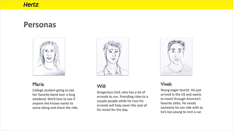
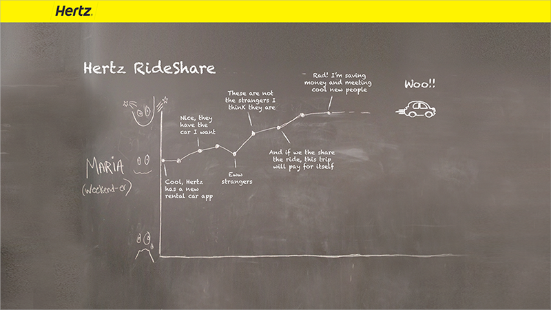
Personas & User Journey Map
Taking the lead on personas, I created a cursory user journey for all three personas and pin pointed each stage the user might “drop off” based on our data.
Personas

User Journey Map
We picked one persona to inform our user flow in our prototype. I saw the User Journey Map as an opportunity to plot and show key points on the map where our research clearly influenced our design decisions

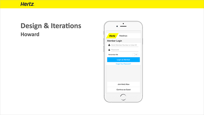
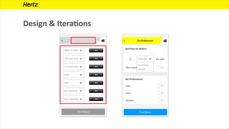
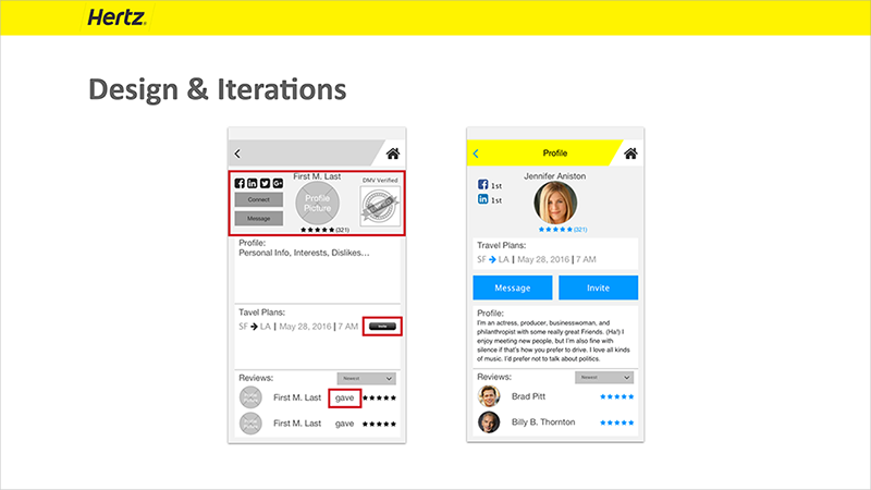
Initial Sketches, Prototype & User Testing
Initial sketches by my teammate.

First round of wireframes my teammate delivered were well designed but heavily detailed. Once we conducted our user tests there were some clear problem areas we needed to address (in red).

HiFi wireframes. My teammate added celebrities to add a little fun and humor to our project.

PRESENTATION
I took the lead on our presentation deck, but for a compelling narrative, I turned to one of my teammates, who’s an excellent writer and storyteller.
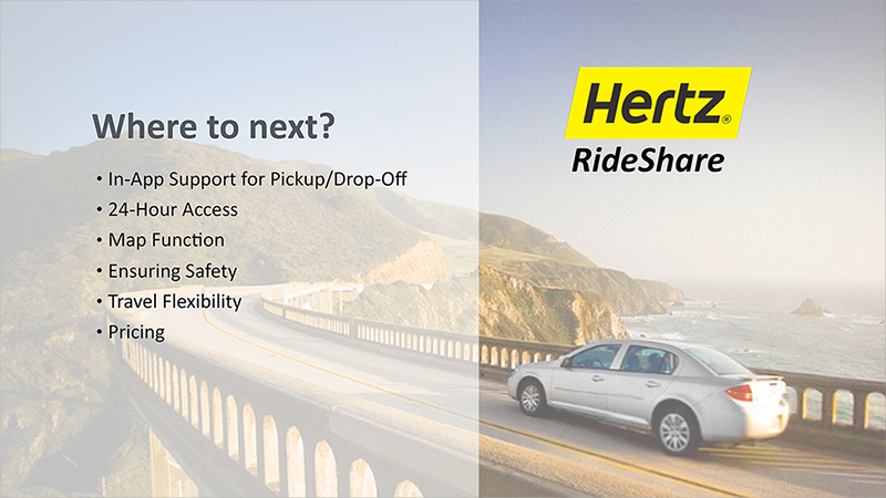
I started pulling some stock images from the existing Hertz website, which I could use as backdrops on the deck — this would create a scenic backdrop for our content, while also keeping in line with the Hertz brand.